Which Colors Create an Illusionary Effect to Make a Room Look Bigger
Ever walked into a room and thought, “Wow, this feels huge,” only to realize it’s quite small? That’s the magic of color.
Ever walked into a room and thought, “Wow, this feels huge,” only to realize it’s quite small? That’s the magic of color. The right shades used in clever ways can trick the eye and transform tight spaces into open, airy retreats. Whether you’re dealing with a compact apartment, a narrow hallway, or a cozy guest room, color is one of your most powerful tools for creating the illusion of space.
Ready to learn the secrets? Let’s dive into the best colors that make rooms look bigger and brighter, plus some pro tips on how to use them like a designer.
1. Classic White: The Timeless Space-Maker
Let’s start with the obvious, but for good reason. White is the go-to color for making a room feel larger, and it works every time.
Why? Because white reflects light. The more light that bounces around a space, the more open and expansive it feels. It also creates visual continuity, especially when used on walls, ceilings, and trim, giving the eye fewer breaks and making the room appear seamless.
Bonus tip: Try a soft white with warm undertones like ivory or cream to keep the space from feeling too sterile. Pair with light flooring and minimalist furniture for that airy, gallery-like vibe.
2. Cool Grays: Sleek and Sophisticated
If white feels too stark for your taste, light gray is a perfect alternative. It’s cool, calming, and adds a touch of elegance while still opening up your space.
Grays with blue or green undertones reflect light well and pair beautifully with neutral furnishings, metallic accents, and natural wood. These tones make rooms feel clean, crisp, and polished, without sacrificing warmth.
Where it works best: Living rooms, home offices, or any space where you want to feel grounded and relaxed, yet still open.
3. Soft Blues: Calm, Cool, and Expansive
Think of the sky or the sea, those endless shades of blue that go on forever. That’s the effect you can bring into your home with a soft, airy blue.
Blues are naturally receding colors, which means they visually move away from the eye, making walls feel farther apart. They also create a serene, peaceful atmosphere ideal for bedrooms or reading nooks.
Try these tones: Powder blue, sky blue, or blue-gray. Pair with white or pale beige accents for a coastal-inspired, space-expanding palette.
4. Pale Greens: A Breath of Fresh Air
Like blues, greens, especially in lighter, muted shades, are excellent at making small rooms feel fresh and open. Inspired by nature, pale green tones evoke a sense of calm and openness.
Sage, mint, or celery green can brighten up a room without overwhelming it. Plus, green pairs effortlessly with natural textures like wood, stone, and linen, giving your space a grounded yet airy aesthetic.
This is a great option for bathrooms, kitchens, or any room that could use a fresh, revitalizing touch.
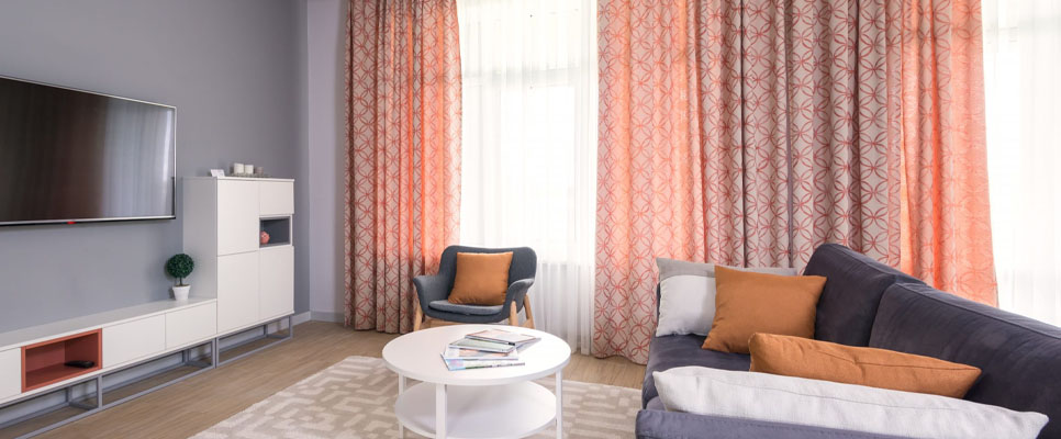
5. Beige & Taupe: The Underrated Neutrals
Don't underestimate the power of beige or light taupe. These soft neutrals offer the brightness of white with a little more warmth and depth. They make a space feel cozy without closing it in.
What’s more, beige pairs beautifully with almost any color: blues, greens, grays, even black. That means you can keep your palette open and versatile while still enjoying that spacious feeling.
Designer trick: Use the same shade of beige on your walls and trim for a monochromatic effect that blurs boundaries and visually stretches the room.
6. Blush Pink: Soft and Surprisingly Expansive
Looking for something a little more playful? Blush pink might surprise you. This gentle hue reflects light and adds a romantic softness that can make a room feel more spacious.
Blush works beautifully in bedrooms or dressing rooms, especially when paired with light woods, brass accents, and plenty of natural light.
The key: Choose a blush with neutral or beige undertones to avoid it feeling too bubblegum or overpowering.
7. Avoid Dark Colors (Most of the Time)
While dark hues like navy, charcoal, or emerald can look stunning, they tend to absorb light and make a room feel smaller, especially if the space lacks natural light.
That said, you can use darker tones in small spaces if you balance them correctly. For example, pairing a deep wall color with light furniture, large mirrors, and plenty of white accents can make a space feel moody but not cramped.
So it’s not a hard “no,” just a design choice that requires balance and intention.
Bonus Tips for Creating the Illusion of Space
Color is powerful, but it works even better when combined with smart design choices. Here are a few extra tricks to amplify the effect:
Paint your ceiling a lighter shade than the walls to create height.
Use mirrors to reflect light and “double” the visual space.
Keep your décor light and minimal; too much clutter cancels out the benefits of an airy color palette.
Use consistent tones across connected spaces to create flow and openness.
Let Color Do the Work
No matter how big or small your home is, color can help you shape how it feels. With the right shades and smart pairings, even the tiniest room can feel open, fresh, and full of life.
So, whether you’re painting a cozy corner or refreshing your entire space, choose colors that not only make your home look bigger but also make you feel better. After all, design is about more than just looks. It’s about creating a space that feels just right.
Subscribe
You will receive the latest news and updates on your favorite celebrities!
Latest posts

Comfortable Walking Gear That Makes Every Dog Walk Easier
Every dog deserves comfort, safety, and freedom during daily walks, playtime, and training.


GrayMatter: Help Your Mind, Support Your Goals, Live Better
We all want to feel good in our bodies and minds.